

Note on Industry Housing Price Data and the CPI
Note on Industry Housing Price Data and the CPI
Rents and home prices in the CPI compared with industry indices

As I noted in a previous post, rent of primary residence and owners’ equivalent rent are being presented by our friends in the inflation hawk world as the latest harbingers of coming sustained inflation. This hypothesis, however, relies on both some misunderstandings of how rents and owners’ equivalent rents are tabulated in the CPI, and a misreading of the available data.
To be sure, it is very likely that there will be notable increases in rents and owners’ equivalent rents (“OERs”, henceforth) over the coming year or so, but the reasons for these increases are fairly nuanced, and quite far from the very basic “home prices went up a lot this spring” explanation being tossed around in some op-ed pages.
There are several critical things to understand about how the BLS comes to its rent and OER figures which can be found in the BLS methodology report on its housing survey, How the CPI measures price change of OER and Rent. The basic things to understand are:
Rent is calculated by asking a sample of renters across the country “What is the rental charge to your household for this unit including any extra charges for garage and parking facilities?”
OER is calculated by asking a sample of homeowners “If someone were to rent your home today, how much do you think it would rent for monthly, unfurnished and without utilities?”
A complex set of weighting measures is then applied to these sample data to account for differences between geographic areas and unit quality and so on, though that is relatively unimportant for this discussion.
Importantly, the samples of renters and homeowners includes both people who have lived in their homes for months or years, and people who very recently moved into their homes. The reason that this is important is because even as new listing prices are rising, those new leases only account for a small portion of the total housing survey sample, according to inflation analyst Omair Sharif. So even as prices are ostensibly rising, their impact on the CPI is blunted and factored in over time.

Comparing to industry data
For rental homes, there are several industry data sources we can use to compare with what the price index is showing us. Below are both the price index for rented homes and the ApartmentsList.com index, which measures the price level of new listings only. Each line is a different metropolitan area within the region. I’ve decided not to include the all of the metro area labels in this version of the plot to make them easier to read and because they’re not very important for the point being made, which is that in general, there does not appear to be, at present, a strong relationship between these two measures.
Rent of Primary Residence
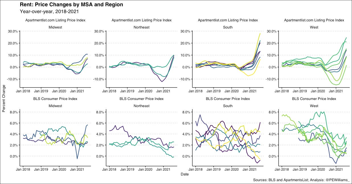
On the bottom row displaying CPI data, we can see quite clearly that there are significant differences between the price movements across metro areas. For example, in the Northeast, we have one metro area that has had negative year-over-year growth in rental prices for the past couple of months, while another has seen actual growth—roughly back to the pre-pandemic trend. In the top row displaying industry data, however, we see all three metro areas in the Northeast region at roughly the same level of growth. This should not confer confidence in the view that industry rental data is an effective proxy for inflation.
While new listing prices in the industry data are clearly rising, year-over-year, this partially a correction for the drop in prices sustained over portions of the pandemic, and the 24-month change for these price changes is of course somewhat more muted, much like we saw with earlier drivers of temporary inflation like used cars and various travel goods and services, the prices will jump up as demand makes a return and will likely settle back into their pre-pandemic trends.
Owners’ Equivalent Rent
With OER’s, recall the questions that are asked of homeowners in the housing survey: “If someone were to rent your home today, how much do you think it would rent for monthly, unfurnished and without utilities?” With this being the case, it should be expected that the OER row has more resemblance to the rent row on the above plot than it does to the home price index, since what the BLS is measuring is actually just a proxy for rental price changes.
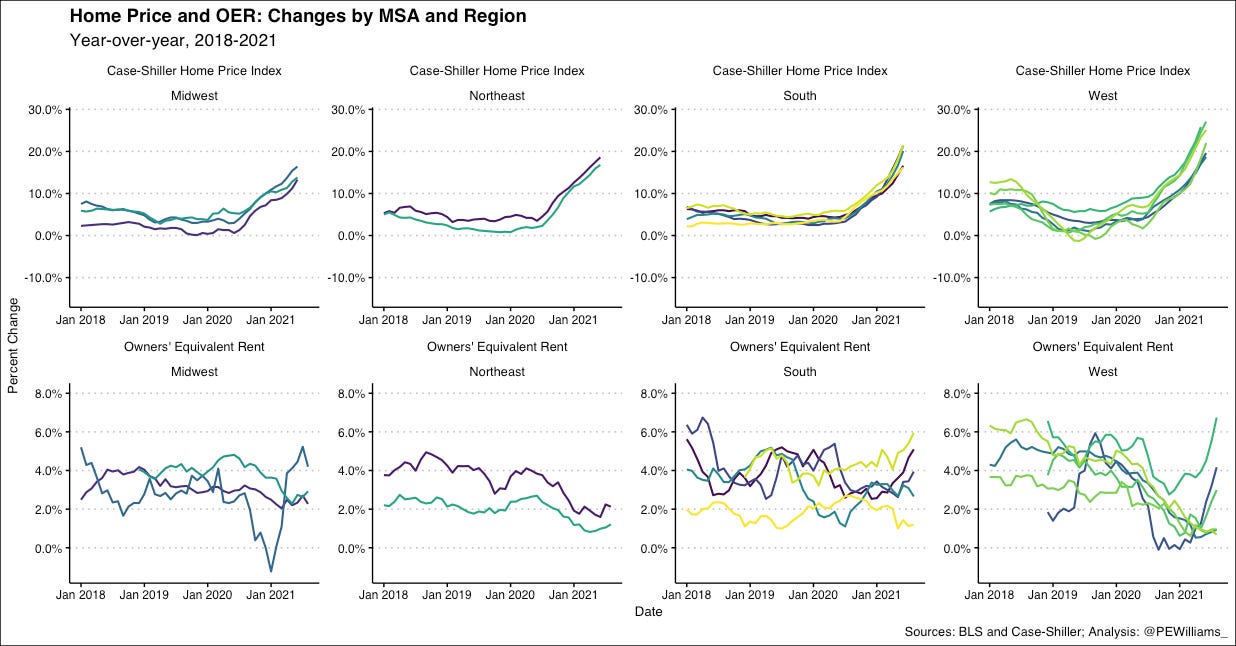
Home prices have gone up significantly, especially in certain geographies, but the extent to which these increased prices could be passed on to renters is unlikely to make up for the total change: the market price for rentals is the market price for rentals. Just because a homeowner paid a higher price does not mean that there is demand for the same unit at a requisite higher price on the rental market. (For additional context, it should be noted that credit for homebuyers is much cheaper today than a year or two ago, so while purchase prices have undoubtedly gone up, monthly costs for owners with an otherwise equivalent mortgage have gone up by a lesser amount, relatively speaking).
All of that is to say: rental prices drive not just rent in the CPI, but also OER. As I noted in the previous post linked at the top, some have tried to draw crude links between the home price index and OER by adjusting for an 18-month lag-time, but even with these adjustments there is just not a strong correlation, and especially not strong enough to base bold inflation predictions on.
A note on geographic differences
One other thing to keep in mind as these trends continue is that we know there was a significant amount of physical moving that happened during the pandemic, be it San Francisco tech workers buying homes in Boise and Denver as work from home policies were rolled out, or New Yorkers moving upstate. We can of course see this in the data: NYC and SF prices tanked during the pandemic, far below other metros, and are slower to recover, while mid-sized metro areas like Boston, Denver, San Diego and Phoenix have all made stronger recoveries. This makes intuitive sense—demand was removed from the large cities and was shifted to smaller cities without making significant changes to the supply, so the prices levels of course will adjust accordingly.
It’s also important to note that the ApartmentsList data as well as the OER data does not do a very good job of accounting for rent regulated units in New York, California, and other localities such regulations, so the price increases we see in those measures are cutting out a significant portion of the market, whereas the CPI of rent does, in fact, account for those units and, accordingly, should be viewed as the more comprehensive measure for this reason, too.
If not crushing inflation, then how much?
It’s tough to say how much change in the price level of rental housing we will see over the next year, but as JW Mason noted last week, a safe bet is that they will simply return to their pre-pandemic trend sometime over the next year, which would put the year-over-year growth at around 4.5%. While we should implement policies to regulate the level of housing cost growth (rent regulations, housing production, socialization of development), if Mason’s reasonable estimates turn out to be true, it would not be the doomsday some are hawking it to be.

